Analytics
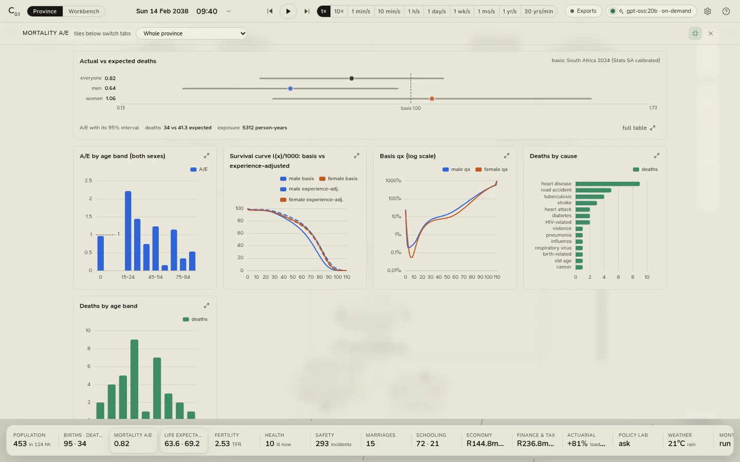
Everything the province does is counted, and the counts are along the bottom of the province view: the analytics strip, sixteen tiles of headline figures. Click a tile and the analytics drawer slides up over the map with that subject's cards; click the lit tile again (or Esc, or anywhere on the map) to close it.
The tiles
| Tile | Shows | Opens |
|---|---|---|
| Population | Residents and households; children and over-65s | Population |
| Births · deaths | Births and deaths since the start, and this year | Population |
| Mortality A/E | Deaths against expected deaths on the basis | Mortality and experience |
| Life expectancy | e₀ on the basis for men and women, and adjusted for experience once there are enough deaths | Mortality and experience |
| Fertility | The realised TFR and births against the basis | Fertility |
| Health | Residents ill now, and in the ward | Health |
| Safety | Incidents, arrests and court cases | Safety and the court |
| Marriages | Marriages, divorces and last Sunday's church attendance | Social and church |
| Schooling | At school and homeschooled | Education |
| Economy | GDP a year, inflation and the repo rate | Economy and finance, at the overview |
| Finance & tax | The Mutual Bank's deposits; the burial society's or SARS's state when either needs attention | Economy and finance, at the Mutual Bank |
| Actuarial | The burial society's premium loading over its pure risk premium | The actuarial workbench |
| Policy lab | A lab job's progress | The policy and stress lab |
| Weather | Today's high and condition, the season, the rain | Weather |
| Monte Carlo | Monte Carlo | |
| Basis | The basis hash | The basis |
A figure turns amber or red when it needs a look: A/E far from 1, a society whose premiums no longer cover its pure risk premium, an insolvent scheme, a taxpayer in arrears, inflation above 6%.
View › Analytics in the desktop app opens every tab by name, including one the strip has no tile for: The burial society, the scheme's surplus process (also in the finance workspace).
The drawer
- Cards. Each subject is a set of cards: a chart or a table with its note. A card with a summary shows a small chart and a key, and its button (full table, full chart or history) opens the whole card; any card can be enlarged. Esc closes an enlarged card.
- Full screen. The ⤢ button in the drawer's header makes the drawer fill the window, and the cards grow to fill it; on a large screen every card of a tab fits at once.
- Scope. The picker in the header narrows the analytics to one city, settlement, household or person. It narrows the composition cards (the pyramid, chronic conditions, relationships, schooling); rates that only make sense for the whole population (A/E, fertility) stay province-wide, and the card says so.
- The event ledger is in the left panel, under Events: every birth, death, wedding, illness, incident, court case, weather event and economic event, newest first, filtered by joy, sad, alert or danger. Click one to go to whoever it involved.
The basis
The Basis tile opens the assumptions the province lives on: the mortality table (qx by sex on a log scale), every parameter and its value, the basis hash, and two downloads: qx table (CSV) (ages 0 to 110 by sex) and event ledger (CSV) (every event the province has kept, with the people involved).
Reading small numbers
The province is about four hundred people. A handful of them die in a year, and most cells of one province's experience are empty, so every rate from one run is noisy, and the intervals say how noisy. Two tools exist for exactly this:
- Monte Carlo runs the same basis on many seeds and reports percentiles.
- The policy and stress lab compares a change with the baseline seed by seed, which cancels most of the noise.
Calibration and limits says what the province can and cannot be read for.