Charts
Eight chart functions that know what an actuarial figure should look
like, on one colour-vision-validated palette. In Python they draw with
matplotlib (pip install "scelo[viz]") and return the figure — no
pyplot state, so a notebook shows it once and a script calls
fig.savefig(...). In R they draw with base graphics on the current
device and return their data invisibly.
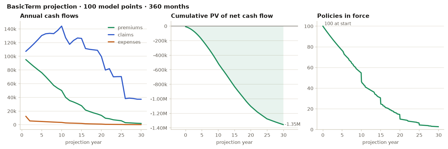
sc.plot_projection(sc.basicterm(mp))            # cash flows · cumulative PV · in force
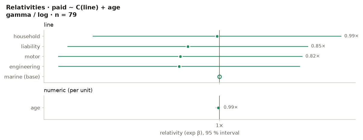
sc.plot_relativities(m)                         # forest plot of a GLM's relativities
sc.plot_triangle(tri)                           # development curves, oldest light → latest dark
sc.plot_rates(df, "province", "lapsed", exposure="exposure")   # rate by group, 95 % CI
sc.plot_scr(scr)                                # the SCR build-up with diversification
sc.plot_csm(ifrs)                               # CSM closing balance and yearly release
sc.plot_bars(series)                            # one-series bars, values at the tips
sc.plot_lines(df, "year", ["actual", "expected"])   # up to five series — then it refuses
sc.save_figure(fig, "projection.png")
A real plot_projection(sc.basicterm(sc.sample("lifelib-mp"))):
and plot_relativities on the claims-sample GLM from the
pricing chapter:
The house style, enforced
The functions carry the lab's chart rules so you do not have to remember them:
- One hue for one series. Magnitude charts use a single green;
comparisons use up to five validated series colours — and only the
first three pass every pairwise colour-vision check, which is why
plot_linestakes at most five series and refuses more instead of drawing an unreadable rainbow. - Ordinal data gets an ordinal ramp.
plot_triangledraws origins oldest-light to latest-dark and labels the first and last. - Uncertainty is drawn, not implied.
plot_ratesputs a 95 % Poisson interval on every bar and an overall-rate reference line;plot_relativitiesputs the interval on every dot and marks the base level hollow at 1. - The numbers are on the chart. Bars are labelled at the tips (up to 30), the projection marks its break-even, the SCR chart labels its diversification credit.
sc.palette() / sc_palette() return the tokens — surface, inks,
grid, the five series colours, a five-step sequential ramp and a
diverging triple — for figures of your own that need to sit beside these.